Search Knowledge Base by Keyword
Profile Photos
This page includes:
- Taking Photos of People
- Cropping Photos of People
- Formatting Photos with Multiple People
- Optimizing Photos
Taking Photos of People
When taking photos of faculty, staff, students or others from the Hunter community, consistency is key.
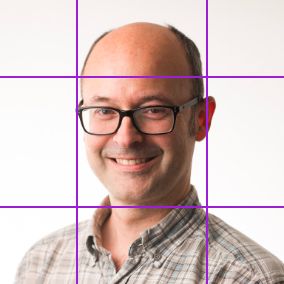
Profile Headshots
In order to maintain consistency and professionalism the following guidelines should be followed for all headshot photography. This is important because headshots appear on individual profile pages and on lists of people (e.g. a list of department faculty).
Photography Requirements
- A recent high resolution JPG photo.
- The person is the only subject in the photo.
- The face is centered, shoulders are visible, both are in focus and facing straight on.
- Work attire (something appropriate for teaching or working).
- Simple, professional-looking background (plain background preferred).
- Good lighting is essential.
Do
- Position in front of a simple or plain background.
- Use the highest quality camera or newest smart phone available.
- Keep the focus on the face, but include the shoulders and space above and around the head.
- Use flattering light, natural diffused light is best (avoid direct sunlight, nighttime, flash and overhead lights).
- Take several photos to be more likely to get one good one.
Don't
- No other people are in the photo.
- No casual photos from family or work events.
- No grainy low resolution photos.
Groups of People
In addition to the profile headshot photography guidelines above, the following is addtional advice for these situations.
For people with notable achievements
- Photos of people with notable achievements are often reused, so a good photo is essential.
- If possible choose a background related to the person's achievements, in a lab, with a book, etc. Otherwise, keep it simple with a Hunter or plain background.
For individual shots of groups of people
- Follow profile headshots above.
- Keep the same distance from each of them with similar framing.
- Use a consistent background.
- Leave extra space around the head/body for more cropping options.
For group shots of people
- Use horizontal/landscape format for groups shots when possible.
Cropping Photos of People
Profile Photos
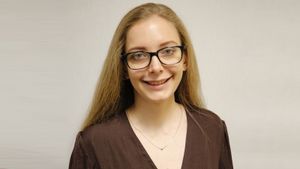
Try to keep photos cropped proportionally so that faces are as similar in size as possible.

Feature Photos
For news or event feature images, when single subjects need to be in the standard rectangle format, fill the entire image. If the background is plain, use photoshop to stretch just the edges to fill the width.
Formatting Photos with Multiple People
For news or event feature images when you want to show multiple people.
Design
- Strive to have them take up the entire 1600 x 900 image space.
- Heads should be as much the same size as possible.
- For 2, 3 or 4 people, if it’s not possible to fit them in without cropping heads, then enlarge photos as much as possible with equal spacing and put on purple (#502883) background. All should have equal horizontal space.
- For 5 or more people, use a group shot or a different featured image, representational of the content, and then use the individual shots inside the article (example below).
- Keep it simple. Don’t use themed or patterned photoshop backgrounds.
- Tip - Create a photoshop template in a 1600 x 900 photoshop file that has 2, 3, 4 equally divided rectangles (for masking) to make processing the graphics faster.
Examples
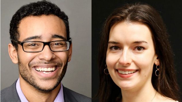
Example of headshots of two people.
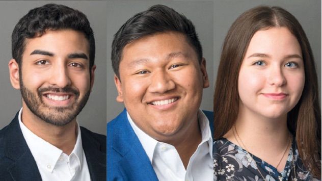
Example of headshots of three people.
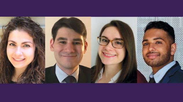
Example of headshots of four people with purple background for extra space.
Optimizing Photos
Standard Sizes for WordPress:
- Square: 768 x 768 - required size for Profile template and most often used
- Rectangle: 1600-900 - could be used in News, Events and other modules where the Profile may be featured
Format JPG or PNG:
- JPG is preferred format for quality vs file size
- Keep below 250k - the lower the better
- You can adjust the quality level for a good balance of quality and file size.

