Search Knowledge Base by Keyword
Right Column Modules
Overview
Right Column Content modules include several optional components that allow editors to create right columns that add additional page information. They may be dragged and dropped to change order.
Note that, on mobile, the right column content is displayed after the main content. So items in the right column should provide additional or related information, but not be critical to the main purpose of the page (that should be presented in the main content area).
This page includes:
Big Buttons
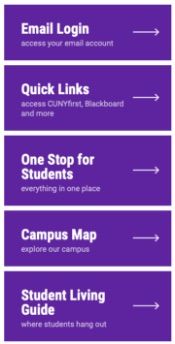
Big Buttons create a noticeable call-to-action for important or popular content. Buttons can be chosen from the Button Library, or custom buttons can be created.
Big Button Module Components:
- Header (max characters 50)
- Button Source (library or custom)
- Button Color (purple or gold)
- Custom Options
- Big text (max character count 25)
- Blurb (max character count 50)
- Link URL
- Add Space Above or Below (options to visually separate from content below)
Learn more about the Button Library.
Custom and Basic Content Modules
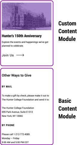
Custom Content Module
Custom content is visually similar to the feed modules and can be used for hand curated lists. Additionally, by using the color overlay option, they can be used as a promo module that matches the main content promo module.
Custom Content Module Components:
- Sub Head (max 100 characters)
- Paragraph (for an additional blurb, if needed, max 300 characters)
- Content Items
- Image (with option for purple or gray color overlays)
- Date (max 50 characters)
- Content Title (max 75 characters)
- Blurb (max 150 characters)
- Link
- Call to Action (for example 'See All News', max 40 characters)
- Show Bottom Rule (option to visually separate from content below)
Basic Content Module
Use this simple text module when additional information is needed in the right column. (Note images come in AT SIZE, they are not scaled down to fit in the column nor are they responsive on different screen sizes. So, if you want to use an image, use the Custom Content Module.)
Basic Content Components:
- Basic Content
- WYSIWYG content style headings, copy and add images of any size.
- Show Bottom Rule (option to visually separate from content below)
News and Event Feed Modules

Feeds
News and events feeds work in the same way, pulling in selected feeds to the right column. This module will only be displayed when content is available. When no content is available, it will be hidden.
Common Module Components:
- Sub Head (max 100 characters)
- Paragraph (for an additional blurb, if needed, max 300 characters)
- Items to Show (1, 2, or 3)
- Show Image
- Show Date
- Show Blurb
- Source - selected source is displayed in breadcrumb after viewing content from this module.
- Hunter Events - select feed
- Site Section - select archive page
- Call to Action - will link to the Source specified (max 40 characters)
- Add Space Above or Below (options to visually separate from content below)
Social Module

Use this module to display social media icons and tags on selected pages.
Social Module Components:
- Sub Head (max 100 characters)
- Social Network
- Link URL
- Show Bottom Rule (option to visually separate from content below)
Right Column on News and Events Pages
Right columns for News and Events landing and individual post pages are only editable by administrators.
Settings Include:
- Events > Event Options
- Events Landing Options
- Single Event Options
- Submit Event Options
- News > News Options
- News Landing Options
- News Article Options