Search Knowledge Base by Keyword
Accessibility Best Practices
This page includes:
- Accessible Filenames
- Document Structure
- Accessible Headings
- Accessible Lists
- Accessible Tables
- Using Alt Text
- Accessible Links
- Color and Accessibility
- Accessible Fonts
These instructions apply to web pages and web-based applications, as well as electronic documents in Microsoft Word, Adobe PDF and other formats. By following these practices, you'll help make Hunter's website and web applications accessible to all users.
Accessible Filenames
A document’s page title is the first thing assistive technology will recognize and read after opening the document. And it's the first piece of information most users will encounter when accessing a document. Meaningful file names help people understand the general topic of the document and make your files easier to find.
Example: PSY-P101_Intro_Psychology_Section_00000_Spring2020_Syllabus_JDoe.docx
Document Structure
Page structure is important for users to understand the article hierarchy and makes for a better ‘read out loud’ experience by allowing users to jump from one heading to the next, or decide if they want to continue reading an article.
Plan content to be in organized categories and subcategories and then translate those to Headings in a meaningful hierarchy.
Follow the guidelines below to help ensure a basic level of accessibility for documents you create, no matter what application you use.
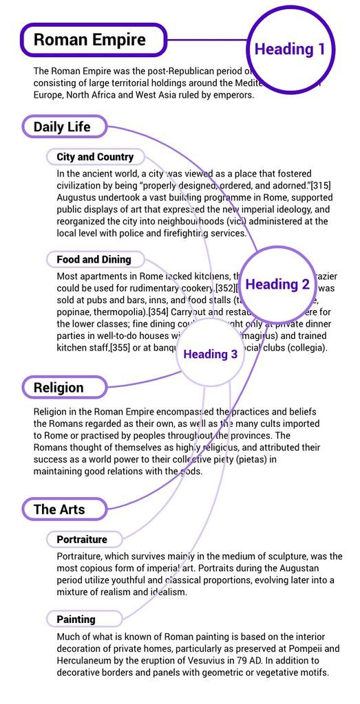
Accessible Headings
Headings provide a way for site visitors to quickly see how a page is organized.
A properly implemented heading structure serves two purposes for users:
- It provides an outline of the page so users can understand how the page is structured and how the sections relate to one another.
- It provides targets so users can jump from heading to heading with a single keystroke (e.g., the letter “H” in some screen readers).
Web pages should follow a hierarchical heading structure, without skipping levels.
That is, each heading should not be presented without its parent heading. So you shouldn’t have an H3 heading without an H2 heading or an H2 heading without an H1 heading before it. This allows assistive technology users to skim the page by tabbing through headings in a logical manner. When headings do not appear in order it can be disorienting to users who cannot see your page.
HTML Headings
Heading tags structure the document and is used on web pages as well as other content creation tools such as Microsoft Word and other formats.
Heading Structure
- H1 is for the page title - there should only be one.
- H2 is for subheadings beneath the main heading.
- Use additional levels of headings (H3, H4) as needed.
- Make sure headings form an outline of your content and avoid skipping heading levels.
Headings in Microsoft Word
In Microsoft Word, add headings using the built-in heading styles (Heading 1, Heading 2, etc.) available in the Ribbon at the top of the Microsoft interface. To change the appearance of any of these heading styles, right click on the style button and select “Modify”.
- H1 is for the document title (not the file name) - there should only be one.
- H2 is for subheadings beneath the main heading.
- Use additional levels of headings (H3, H4) as needed.
- Make sure headings form an outline of your content and avoid skipping heading levels.
Accessible Lists
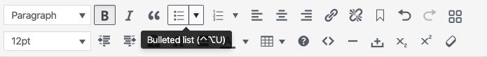
Use Built In Lists (Bullets or Numbers) to Order Items
Create lists using the built-in bulleted list feature. Lists created in text will not be conveyed accurately by assistive technology. Using the built-in feature allows screen readers to convey to readers that they’ve landed on a list. It will then let them know additional information, like the number of items in the list.
- Use bulleted lists for groups of related content.
- Use numbered lists for sequential steps.
Accessible Tables
Tables should be used only for presenting rows and columns of data.
People who are unable to see the table rely on the table author to provide markup that explicitly defines the roles and relationships of all the parts of the table. For example, all column headers must be identified as column headers and row headers must be identified as row headers.
Create tables correctly using the built-in feature. Do not ‘draw’ a table using rules.
Additional resources on tables:
Using Alt Text
Alternative text (alt text) descriptions are required for all types of visual content (png, jpg, gif files).
Alt text will be read aloud when a screen reader encounters an image, which helps individuals using assistive technology understand the content of the images or graphics.
General tips:
- Whenever possible, the text of a website or document should be written as text, rather than as part of an image or other graphic.
- Alt text should succinctly describe the purpose or content of the image in the fewest possible words.
- If the image is purely decorative, and does not serve an informative purpose, alt-text is not required. In some applications you can mark an image as decorative.
- For complex images or graphics, include a thorough description of the graphic in the text of the document immediately before or after the image.
Alt-text in Microsoft Word:
To enter alt text in Word, right click on the image, click on format picture and navigate to the Alt text option. Input the appropriate alt text and the title of the image.
Accessible Links
Use Descriptive Text Labels for Links
Avoid phrases such as “click here” and don't use website addresses that are not written out as they do not inform the links purpose or where it is actually going to.
Incorrect: Stay up-to-date on all things Hunter College by clicking here.
Correct: To stay up-to-date read Hunter College News.
Why use descriptive links:
- Most assistive technology software provides users with a list of the links in a document, no matter the user's current position in a document. This feature removes links from their original context, which can make it difficult for users to understand why a link might be included.
- Also, if a link in a document is simply the document's URL, some screen readers may end up reading the URL out letter-by-letter. Using descriptive text for links will avoid this.
Write Out Full Email Addresses
Incorrect: For more information contact Lauren at Hunter College.
Correct: For more information contact Lauren at ljones@hunter.cuny.edu.
To link email address use:
<href="mailto:example@example.com">example@example.com
Link Phone Numbers
Link phone numbers so that uses on mobile devices may tap and dial.
To link email address use:
<href="tel:212-772-4000">212-772-4000
Color and Accessibility
Use color sparingly and, when you do, ensure there is high contrast.
Low color contrast between the text and background colors in a document can make text difficult to read. Try to use simple, high-contrast color combinations such as black on a white background, or white on a black background.
For color blind:
To make text more readable for color-blind users, limit the use of reds and greens.
If you are unsure if the contrast is sufficient, use Contrast Finder to check.
Accessible Fonts
Use Standard Fonts. Although screen readers help in deciphering text for visually impaired users, choosing fonts that are easily legible will benefit more users from the outset.
- When creating your document, use standard, easy-to-read fonts such as Arial or Helvetica.
- To improve accessibility and legibility and avoid confusion, websites should use as few fonts as possible.
- Consider your audience when choosing font size. Most websites display paragraphs and other normal text at a size of 12 to 14 points, but this can be increased to improve legibility for users who need extra assistance.
- Do not use decorative fonts such as Brush Script.
- Ensure that the font size in your document is at least 10.
- Avoid using the appearance of a font to convey meaning. Bold and italic text should be used only when necessary, as not all screen readers inform users when text is bolded or italicized.