Search Knowledge Base by Keyword
Module Overview
This page includes:
Module Overview
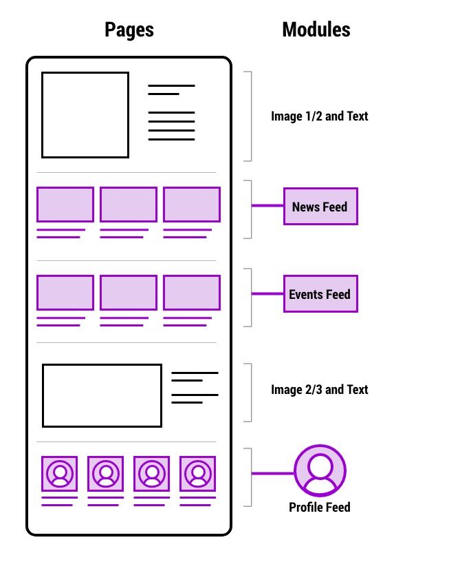
Pages are built in a framework of page templates and modules. Modules are the flexible building blocks of the pages allowing editors to display content in a hierarchal manner to help users find, or discover, the information they need.
Modules are custom content-based or feed-based. Feed-based modules (News , Events and People Profiles) have one entry in the CMS that can be pulled into one or more site pages. This allows the article to be edited in one place and the changes to appear immediately everywhere that article appears. And it allows the most recent content to automatically populate the modules.
More about:
- The WordPress framework.
- Feeds: news feeds, events feeds, and people feeds
More on Modules:
- Modules include several optional components allowing editors to create containers that fit their content needs.
- There are different modules for different parts of the page and vary depending on the page template you are using.
- Feed modules pull in the most recent articles or events, or for when using profiles. This allows the articles, events, and profiles to be edited in one place and the changes to appear immediately everywhere that content appears.
- Modules may be dragged and dropped to change order.
Common Module Components
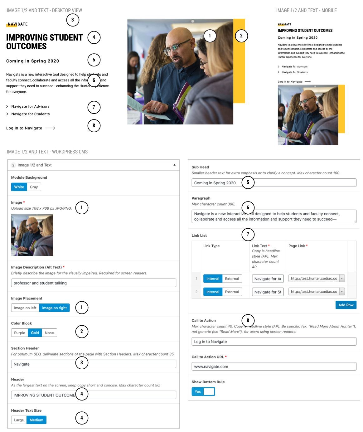
Annotations refer to published page and CMS screenshots
- Image
- Depending on selection, image size requirements for flexible content modules will be 768x768 or 1600x900
- Image Placement
- Image can be on left or right, but note the order for mobile is whatever is on left is stacked on top of what is on the right.
- Alternating sides can add visual interest and break up the monotony of a page. However if a longer list of similar content, all on the same side and more orderly might make it easier for the user to find/understand info more quickly.
- Color Block
- Additional visual interest, can choose purple or gold. Or, alternately, choose none and the image will appear slightly bigger taking over the unused space.
- Section Header
- Delineates a page section for screen readers. Also, helps people scan the page to understand the groups of content they are being presented with.
- Header
- The big idea. Less words here for emphasis. But, if more words are required, there is a smaller size to choose from here.
- Header Text Size - Smaller option of header text to accommodate tighter spacing on left navigation or right column templates.
- Sub Head
- Additional header, can be used in conjunction with the Header or instead of the header.
- Paragrap
- Expand here on the big idea, compelling people to learn more.
- Link List
- Use if there are multiple places to send people too, use a list. For example it could be Learn More, Our History, Our Academics.
- Call to Action
- If above links are not used, use this one to find out more information on the big idea.
- In (most) modules that have CTAs, there is a "CTA Style" option which allows you to toggle between the original "Text" style CTAs and new "Button" style CTAs. Button styles should be used only where you'd like to use a Big Button but need it more closely associated with the content. Do not add more than 1 Button style CTA per page.
Add Space Above / Below
- Some modules include a toggle, at the top of the module, to turn on or off space above or below a module.
- Toggles are set to most common use however some module placements or ordering may require adjusting space.
- It's important to preview pages as they are built. When the spacing appears inconsistent with the rest of the page, check to see if this toggle is available to adjust the spacing.
Module Spacing
There are 2 elements on various modules to aid in spacing:
- Show Bottom Rule - to separate modules with different concepts, add a rule between. However, some modules go together and should not have a rule.
- Add Space Above / Add Space Below - depending on the module selection and order, some modules will bump up against each other. In that case check one of these boxes to add appropriate spacing.
Always preview pages and check spacing before publishing.