Search Knowledge Base by Keyword
Hunter Visual Identity
Hunter’s Brand
Hunters's Visual Identity provides information for these aspects of Hunter's brand.
For design tips and specific information specific to the Hunter website see the website style guide.
Hunter Logos
Overview
The Hunter College logo consists solely of lettering derived from the combination of a pre-existing typeface and a customized typeface. There are no marks or other symbols associated with, or as part of, the Hunter College logo. Hunter’s logo is always used without any type of modification and is the only logo that should be used in all of Hunter’s print or web materials. Authorized files of the logo may be obtained from from Hunter’s Office of Marketing and Communications.
Hunter Logo Colors
The Hunter logo can only appear in the Hunter Purple or in black. It can also appear in white on solid or dark colors and photo backgrounds, provided there is sufficient readability.
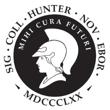
Hunter Seal
The use of the official college seal is reserved for the Office of the President and for the use on official legal documents such as diplomas, certificates, transcripts etc. It can also be used for official “ceremonial functions where the seal can appear on approved plaques, flags/banners or furniture.
Note:
-
- The seal is not the college logo and should never be used in lieu of Hunter’s logo and no college unit should develop a logo that incorporates the seal or part of it.
- Special permission should be requested from the office of Marketing and Communications if an office wishes to use the seal as a design element in any printed material such as brochures.
CUNY
Please refer to CUNY Brand Guidelines for use of the CUNY logo integration into college logo lockups, page integration, messaging and more.
Color Palette
Hunter Color Palette
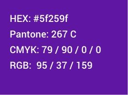
Purple (primary color)
Use cases:
-
- Hunter Logo
- Big Buttons
- Color Blocks
- Color Overlays
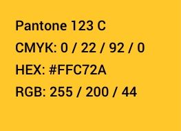
Gold (accent color)
Use cases:
-
- Color accents
- Bar attached to Section Header (H2)
- Color Blocks
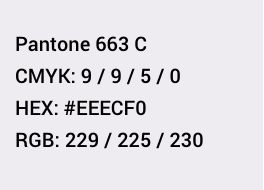
Gray (backgrounds)
Use cases
-
- To delineate different sections on a page
- Most often used on landing pages
Color Usage
Color Blocks
In general, the use of large, strong color blocks are encouraged as a design element. Some examples below
Accents on headers
-
- Color behind short all capped header as an accent to differentiate sections of a document or web page

Big buttons
-
- For large call-to-action buttons. Brief copy used in all caps
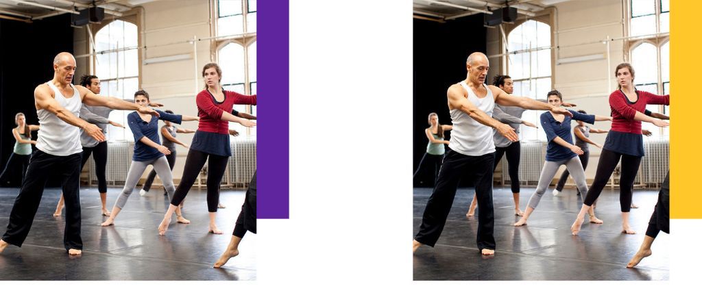
Color blocks next to photos
-
- As an added branding element
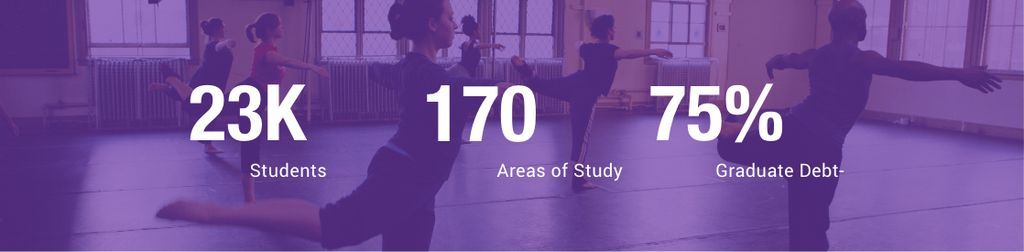
Color overlays
-
- A Hunter purple or black overlay over images. Opacity can vary depending on image and usage. If typography is over the image, ensure that copy is very readable as it must see accessibility guidelines

Background Sections
-
- To delineate or highlight sections within a page, use the supporting gray color
Fonts
Primary Fonts
Roboto Condensed
-
- Primary headers should be set in Roboto Condense, uppercase. Note, phrases set in all uppercase should be short and direct, long phrases in upper case are hard to read
- Download Roboto Condensed from Google
Roboto Regular, Medium and Bold
-
- With the exception of primary headers, most copy should be set in Roboto
- Download Roboto from Google
Alternative Fonts
Arial
-
- In cases where Roboto is unavailable, use Arial. This font is included in all operating systems and is the safest choice for documents that will pull fonts from the end users computer (such as PPT documents that do not have fonts embedded in the file)
Typography
Modules
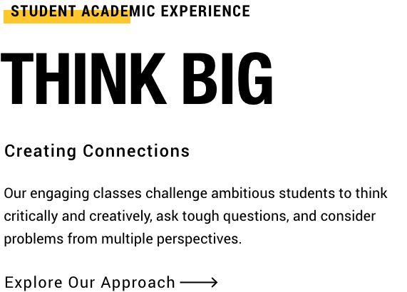
For promotional modules, use short attention grabbing headlines to entice your readers to read more. This example shows 3 different headline styles that are designed to use together or independently.
Note:
-
- Headers are intended to be attention-getting, short, and direct. They do not include punctuation. If clarification is needed, use supporting copy below
- Follow AP style editorial guidelines. See the Editorial Style Guide for more information
- For accessibility purposes, calls-to-actions describe the information you will get from the link (don’t just say Read More or Click Here). More information is provided in Editorial Style Guide
Buttons & Links
CTA Arrow
-
- Roboto Regular
- Letter spacing 60
Big Buttons
-
- Roboto Condensed Bold
- All Caps
- Letter Spacing -20
- Small copy underneath to clarify.
Links
-
- Links are same color as copy (black) underlined, gray on hover
- Can be bolded for emphasis
Paragraph or Body Copy
-
- Body copy should be easily readable
- Break information up into multiple paragraphs
- The optimal line length for readability in body text is considered to be 50-60 characters per line
Standard sizing on the website:
-
- Roboto Regular
- Font Size 20 px
- Line Spacing 32 px
Photography

Photography is an important part of our brand to help tell stories and show our diverse community.
Some things to keep in mind:
- Images must be diverse to reflect our community
- Using images from Hunter is encouraged when possible, for people and campus
- Always keep the written content in mind when choosing imagery
- When combining images, do not silhouette and collage images together, keep them in neat blocks
- When there are cropping issues, or you need a background color, use Hunter purple
- When combining headshots, try to keep the heads the same size
- Avoid overly staged or composite images that feel too ‘stocky’
What Not to Do
Do not embed text on to images
- In order for images to be accessible to everyone, and readable on mobile devices, text should not be embedded on to images.
- If you must embed text, make sure it’s as little as possible, as large as possible and there is enough contrast that it is readable. If used on the Hunter website, the alt text should reflect what is embedded.
Do not use gradations or drop shadows
- Hunter branding is meant to feel confident and assured, soft gradients and drop shadows do not convey this feeling.
Do not use yellow in copy
- Hunters secondary gold color should not be used for copy as it will likely not pass accessibility standards.
Do not combine purple and yellow
- For the website and academic-related publications, purple and yellow should not be used on top of each other (yellow text on purple background or vice versa). The colors combined in that way feel more sporty than academic.