Search Knowledge Base by Keyword
Website Style Guide
This page includes general style guidelines for Hunter's WordPress theme:
CMS Notes
Note: Style instruction is included everywhere in the CMS, please observe!
Text Alignment
All copy should always be left aligned on the website.
- If copy is supplied to you as centered, change to left aligned
- This does not apply to supplied documents (PDF, MS Word, etc)
Rules
Rules (horizontal lines) separate content on the page and are included on most modules.
- Rules are on automatically on
- Use bottom rules between each module, except above sections that include a background color or image (quote, stats)
- For the last module on the page, turn off the rule
Left Column Menu
Left navigation is displayed as the Left Column Menu.
- Keep consistent - site navigation that changes as from one section of the website to the next is confusing to the user
- Short simple, and consistent, naming is best
- Don't link to outside websites in the left navigation
- When site sections include About and Contact pages:
- About is always first in the left column menu
- Contact is always last in the left column menu
Lists
Use bulleted and numbered lists to help identify key points.
- Copy should be short and to the point
- Only use numbered lists for a list of items that go in consecutive order, otherwise use bulleted lists
Big Buttons vs CTA Links
For links to important areas of the website there are Big Button modules or call-to-action (CTA) links.
- CTA links are usually specifically related to the content it is sitting next to
- Big Buttons are more prominent and can be used for:
- a big idea that entire page is talking about
- a separate, but vitally important, area of the website
Tips on usage.
- It’s important to steer users to the information they need.
- Do not use too many Big Buttons or CTA links. In order to do that buttons or links must be clearly visible. Only show the most important ones, too many links make the one they want harder to find and the page more confusing to digest.
- Use short phrases that prompt the audience to take an action.
- Placement should be considered by content.
- Towards the top of page — to take users to a place you know they want to go to. Example: A link to downloading an app that users already know they need.
- Bottom of page — users may need to read the content and then be prompted with a button. Example: describing an event that must be signed up for.
- Right column — Departments or offices that are closely related to the page content. Example: Bursars office might have a button to Financial Aid.
Module Components
Use module components consistently.
- Section headers (H2s) - if using on one section of a page, use on all
- Header text size (Medium or Large) - when using the same module multiple times on a page ensure the headers sizes are the same
- If using color blocks on multiple modules on a page they should be the same color
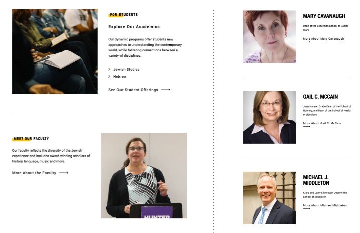
Images Left/Right
Image/text modules allow image placement on left or right.
- Modules include: ‘Hero - Flexible’, ‘1/2 and Text’ and ‘2/3 and Text’
- In general, be thoughtful about image placement
- For multiple modules it's best to alternate the images (left/right) going down the page
- Alternately you could place them all on one side, best for special lists
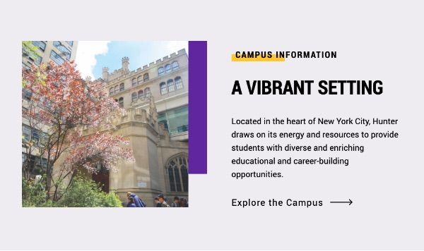
Background Color
A background color may be applied on certain modules.
- Modules include: image/text modules ‘1/2 and Text’ and ‘2/3 and Text’ and the grid module ‘Grid - Custom Content’
- Use this to separate content from the rest of the page - for example a special promotion or event that is new or temporary
- Be sure to turn bottom rules OFF of the module directly above any module that has the background color turned on, otherwise a rule will display against the background color
- There is only one background color

Color Blocks
Color blocks of purple or yellow may be displayed next to the image of some modules (Image 1/2 and Text, Image 2/3 and Test, Slideshow/Video).
- Modules include: image/text modules ‘1/2 and Text’ and ‘2/3 and Text’ and ‘Slideshow/Video’
- This is useful to highlight the content, but is best used on special marketing pages or on a landing page to help it stand apart from the other pages in that section
- If not needed select Color Block: None

Color Overlays
Color overlays are used on the Promo module to dim the photo so white text may be easily read over it.
- Choice is between gray and purple
- Purple is ideal for more Hunter-branded promotions
- Note purple does looks dull over very warm images and gray may be a better choice
- If adding promotion to Right Column use Custom Content module where you can choose an overlay on the image to match the main promotional module used elsewhere
Directional Instructions
Copy with sequential instructions example:
Navigate to Records and Enrollment > Enroll Students > Enrollment Requests.
- Use greater than symbols between events clicks
- Copy is in italics
- Don't use arrows (→) as they are used as call to action links