Search Knowledge Base by Keyword
Main Content Modules
Overview
There are many different content modules to choose from. Each of these modules displays content in a different way.
- Grid
- Carousel
- Images/Text
- Slideshow/Video
- Lists
- Accordion
- Data Table
- Basic Content
- Promo
- Quote
- Stats
- Contact/Social
- Big Buttons
See how to Edit a Page for information on adding, editing and removing modules.
Grid Modules
Grid modules display content in a grid format on the page. There are several types of grids, each with their own use. For all grid module types, there are three things to consider:
Display Options:
- Selecting how many columns to display affects the size of the photos and modules. For example, choosing to use only 2 columns will display larger content blocks or images for more emphasis.
Photo Size Requirements:
- Custom content, news and event photos are 1600 x 900 rectangles.
- Profiles must be 768 x 768 square.
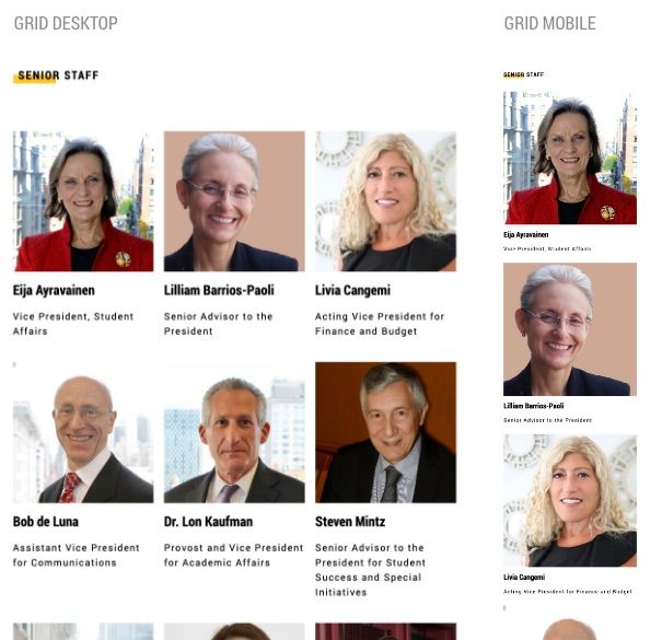
How Grids Display By Device:
- On desktop, grid modules display left to right, row by row.
- On mobile devices the grid modules will stack.
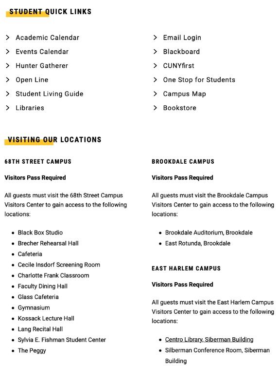
- See example below:
Custom Grid
Display a module of custom pieces of content. This is useful for displaying groups of related content such as initiatives, programs or services. These may display an image and optionally link to a page.
- Header Components
- Desktop Items/Row (2, 3, or 4)
- Grid Items
- Show Image
- Show Date (max 50 characters)
- Show Title (max 75 characters)
- Show Blurb (max 150 characters)
- Link URL
- Call to Action (for example 'See All News', max 40 characters)
News and Events Feed
Display a module of news or events feeds on a page.
Selecting a feed is required. Use the Call to Action field to link users to a page to display all news or events for that feed.
- Header Components
- Desktop Items/Row (2, 3, or 4)
- Desktop Rows (1, 2, or 3)
- Show Image (note feed modules will skip content that does not include a photo)
- Show Date (max 50 characters)
- Show Blurb (max 150 characters)
- Source - selected source is displayed in breadcrumb after viewing content from this module.
- Hunter Events - select feed
- Site Section - select archive page
- Call to Action - will link to the Source specified (max 40 characters)
More about News Modules and Events Modules
People Custom
Display a module of custom selected people on a page. This is useful for displaying a group of people who are not necessarily in the same department. It can also be used to display a single person in a more prominent way.
Use the Call to Action field to link users to a page with more information about that user or group. For a single VIP, display as 1 Desktop item per row to show as large image.
Note: If you want it to link to profiles that remain in this site section use the People Profile template. If you want to link to profiles in /people, do not create a People Profile template.
- Header Components
- Desktop Items/Row (1, 2, 3, or 4)
- Show Image
- Show Small Image (to show hierarchy on a page, you may want a smaller photo displayed in some modules)
- Show Title (max 75 characters)
- Show Blurb (max 150 characters)
- Link URL
- Call to Action (for example 'See All News', max 40 characters)
People Feed
Display a module of people on a page. This is useful for displaying a department or group of people. People must be entered into the Faculty and Staff Directory in order to display.
Selecting a feed is required. Use the Call to Action field to link users to a page to display more information for that group.
Note: If you want it to link to profiles that remain in this site section use the People Profile template. If you want to link to profiles in /people, do not create a People Profile template.
- Header Components
- Site Section (the section the people live in)
- People Groupings (there may be multiple groups within this one module)
- Group Header (max 35 characters)
- Role (for example 'staff')
- Desktop Items/Row (1, 2, 3, or 4)
- Show Image
- Show Small Image (to show hierarchy on a page, you may want a smaller photo displayed in some modules)
- Show Title (max 75 characters)
- Show Profile Summary (max 150 characters)
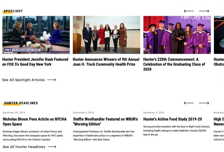
Carousel Modules
Carousel modules display multiple pieces of content in a single row. On mobile, one piece of content is displayed with the ability to swipe to view more. Rows of carousel modules are useful on landing pages because they allow users to discover new types of content as they scroll down the page.
Common Carousel Module Components:
- Header Components
- Set the number of desktop items per row 2, 3 or 4 (the lower the number is the larger the image that will be displayed)
- Photos (note feed modules will skip content that does not include a photo)
- Feed Source (for events, news or people feed modules only)
- Date (Max 50 characters)
- Content Title (max 75 characters)
- Blurb (max 150 characters)
- Link (for custom content only)
- Call to Action (for example 'See All News')
Carousel Modules Include:
- Carousel - Custom Content
- Carousel - Events Feed
- Carousel - News Feed
Images/Text Modules
Images and text modules are flexible modules for landing pages that are useful for promoting other areas of the website. Options include setting the side where the image falls, background color, a list of links and three sizes of headers. These may be mixed and matched to best suit the content. Use the optional background color to help offset particular pieces of content from the rest.
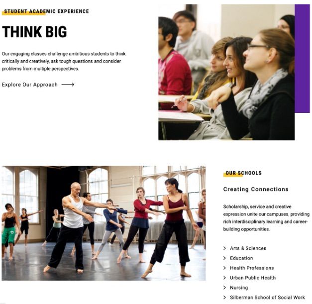
Common Image and Text Module Components:
- Header Components
- Module background options (white or gray)
- Image and image placement (left or right side)
- Color Block options (purple, gold or none)
- Link List (internal or external links, max 40 characters)
- Call to Action (For example 'See All News', max 40 characters)
Image and Text modules include:
- Image 1/2 and Text
- Image 2/3 and Text
Slideshow/Video Module
This is a large full-column feature module useful for displaying images, video or a combination of both. One to six images or videos can be displayed.
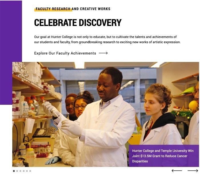
Slideshow Module Components:
- Header Components
- Color Block options (purple, gold or none)
- Link List (internal or external links)
- Slide options
- Image, with option to add caption to each
- Video: Vimeo, YouTube (see how to add video)
- Up to 6 slides may be displayed
- Call to Action (for example 'See All News', max 40 characters)
Lists Module
This module is used for linking to internal and external resources. It is useful for grouping content in a way that allows users to easily find what they are looking for. Categories of links can be displayed to create a hierarchy.
List Module Components:
- Header Components
- Number of Columns (1 or 2)
- List Style (bullet, carrot, no symbol, numbered)
- List Title (max 35 characters)
- List Sub Title (max 100 characters)
- Paragraph (max 260 characters)
- Item text (max 80 characters)
- Option to link items
- Call to Action (For example 'See More Locations', max 40 characters)
Accordion Module
For FAQ or similar pages, use accordions to help users find what they are looking for without having to scroll down a long page. Users can click on an arrow to open and close specific pieces of content.
Accordion Module Components:
- Header Components
- Content Title (max 90 characters standard, 60 for news)
- Content - WYSIWYG, can include simple tables, block quotes, etc.
- If there are multiple sections of content within individual accordions assign H3 headers set to font size 18 to denote sections to make it easier to scan (and more accessible).
- Content Call to Action - available within accordion sections (for example 'See More Locations', max 40 characters)
- Module Call to Action (for example 'More Information on CUNY', max 40 characters)
Data Table Modules
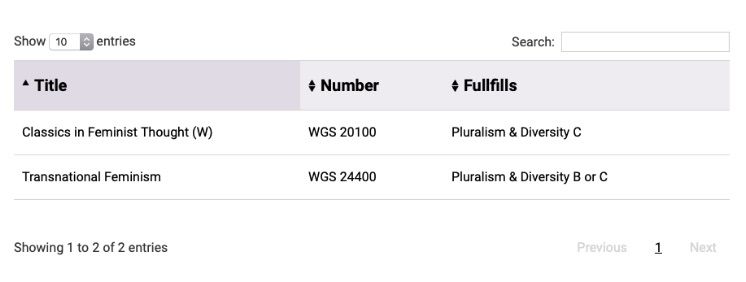
Use tables to present data in a way that makes it easier to read and access. The Data Table module is for long complex tables that can be sorted, searched and paginated.
For simple tables, use the table feature in the Basic Content module.
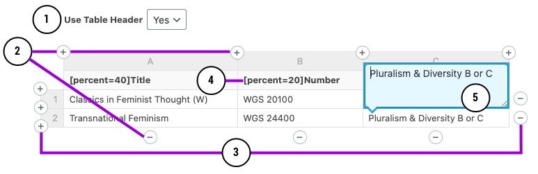
Data Table Components:
- Header Components
- Use Table Header (#1)
- Yes makes the first row a header in the table
- No makes no header in the table
- Data Table
- Uses + and - icons to add/delete columns and rows
- Add/delete columns (#2)
- Add/delete rows (#3)
- Column width will be set automatically by default. If desired, column width can be controlled by adding [percent=X] before one or more column header titles to assign a percentage width. For example, "[percent=40]Title" will make the Title column 40% of the table's width. The percent indicator will not be displayed in the column header on the page. (#4)
- Inputting data is done manually, tabbing to next cell, in blue dialog box (#5)
- Number of entries, search and pagination is automatic
- Uses + and - icons to add/delete columns and rows
- Call to Action (for example 'More Information on CUNY', max 40 characters)
Basic Content
The Basic Content module is used for adding long bodies of copy. Images of any size may be used within the copy. You can also create simple tables, block quotes, bulleted and numbered lists to further organize content.

Basic Content Module Components:
- Header Components
- Limit Width (defaulted to Yes for readability, but there may be cases where content needs to span the full width of the page)
- Content Options
- WYSIWYG content style headings, copy
- May add images of any size
- Simple quotes
- Simple tables
- Show Bottom Rule (option to visually separate from content below)
- Call to Action (For example 'Find More Information', max 40 characters)
Basic Content Module Tips:
- Use dropdown to format text headers and paragraph content.
- Use H2 to H6, in order, for accessibility purposes.
- Use headers to create hierarchy on the page and break the content into digestible chunks for the user.
- Avoid very long paragraphs, break into smaller chunks for better readability
- Any size image can be uploaded to the page, but wrapping text around small images can get tricky so it's especially important to preview on all device sizes to ensure the best results.
Basic Content Module Special Features
The Basic Content Modules WYSIWYG component allows for insertion of special features through codes called Shortcodes. Some of those features include adding jump links, special catalog codes, forms and campus maps.
More about how to add special features to the Basic Content Module
Promo
A simple module to promote a specific piece of content that stands apart from other page modules.
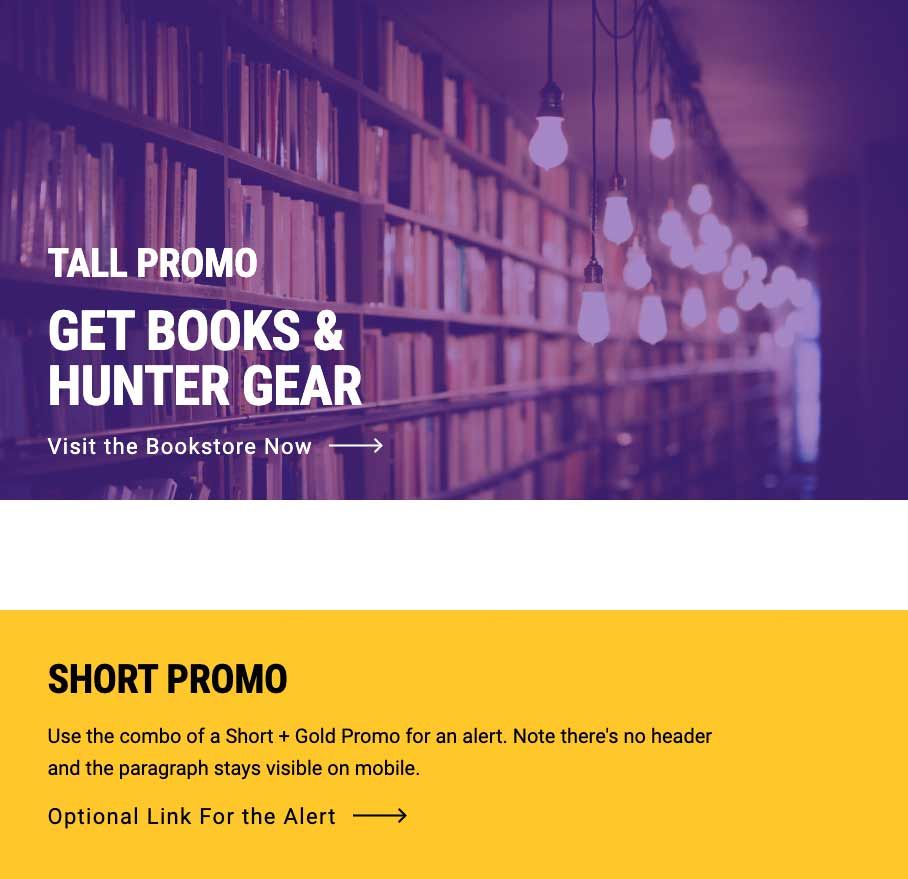
Promo Module Components:
- Header Components
- Color Overlay Options (gray, purple, gold)
- Purple and Gold backgrounds should mainly to be used in combination with the "Short" height for alerts.
- Image (if image) - module background is cut off depending on device size. Use images that can be cut off at any point. Similar guidelines as the full width hero apply. Be sure to preview to ensure that copy is readable over the image.
- Call to Action (max 40 characters)
- Module Height (short, tall)
- Use the original "Tall" option for promoting special features (e.g. promoting Hunter on Demand when it launched). Tall promos have eyebrows, headers, paragraphs and CTAs. The paragraph does not appear on mobile screens.
- Use the new "Short" option sparingly for alerts (like the QUICK ALERTS notifying of system updates in the IT site that's being built now). Short promos have eyebrows, paragraphs and CTAs. All elements appear on all devices.
Quote
Add more voice to a page with a quote.

Quote Module Components:
- Module Background Options (gray, image) - module background is cut off depending on device size. Use images that can be cut off at any point. Similar guidelines as the full width hero apply.
- Quote (max 275 characters)
- Byline (max 80 characters)
Stats
Add more context and information to a page with stats.

Stat Module Components:
- Module Background Options (gray, image) - module background is cut off depending on device size. Use images that can be cut off at any point. Similar guidelines as the full width hero apply.
- Stats (max 5 characters) - for big impact, stats are large. Make sure to round numbers and use symbols to fit in character count.
- Blurb (max 50 characters) - what the stat is about
Contact/Social
The Contact module displays contact and social information for an individual or an office. This module may display both Contact and Social, or just one.
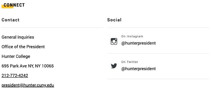
Contact and Social Module Components:
- Section Header (max 35 characters)
- Address Source
- Custom
- Address Column Header
- Address Line Text, maximum 5 lines. Contact information is manually input and updated.
- Address Link URL, Address may include a map link.
- Phone, Ext, and Label
- Email and Label
- Person ID or Department ID
- Pulls contact information automatically from the Faculty Staff Directly (FSD) so details are up-to-date.
- To find their ID, use the whitepages version. Search for the person or department. Find the ID in the 4 digit of the url (website address).
- Example: http://whitepages.hunter.cuny.edu/details/1561
- Custom
- Show Social Column
- Social Column Header
- Social Network: choices: Facebook, Flickr, Instagram, LinkedIn, Twitter, Video, YouTube
- Link Text, URL - individual handle (@name) or page name with URL
- Show Bottom Rule (option to visually separate from content below)
Big Buttons
Select from the library of buttons, or create a custom button, if you need to include a large call to action on a page.
Note Big Buttons also may be used on Right Column Templates in the sidebar.
Big Button Module Components:
- Header (max characters 50)
- Paragraph (max characters 150)
- Button Source (library or custom)
- Button Color (purple or gold)
- Custom Options
- Big text (max character count 11)
- Blurb (max character count 28)
- Link URL
Button Library
When possible, use buttons from the Button Library. Adding a button will make it available in the library for others to use. Edits to a library button are immediately applied everywhere that button appears on Hunter’s site. Deleting a library button removes that button from the library and from every page where that button is used on the site.
More information about adding buttons to a page and managing the Button Library